Color is the number one influencer in product purchasing, ranging from 65% to 80% of the decision-making process. With so much importance residing in the choice of color, making the best choice is paramount.
Pantone has been helping people make the correct color choices for close to the last 60 years. Regarded as the de facto world standard in color communication, Pantone has extremely valuable color tools appropriate for many different uses.
As essential as Pantone is to communicating color, it also is a bit idiosyncratic. There are many features particular to Pantone that once understood, can help use the system more accurately and efficiently.
This guide serves to inform the Pantone user as a primer to the entire system and to help you get the most out of all their products.
Before we dive into the details of Pantone, it's important to know what it is and how it got here.
In this chapter, we'll review at a basic level, what Pantone is.
We'll also review the Herbert family and the back story of how Pantone became what it is today.
Finally, we'll provide a high-level summary of the different systems that make up Pantone preparing us for the rest of this guide.
What is Pantone?
You would be surprised how many people ask me this exact question.
Just a couple of days ago, a young apparel designer came into our shop and said she doesn’t know what Pantone is but was told we would help her. My basic answer was this:
"Pantone is like a color dictionary that has a name and/or a number associated with every color, so you know exactly what color you are referring to."
Instead of just telling your manufacturer, “Make it in red.”, now you can say, “Make it in Tomato #18-1660 TCX.”
Then to make sure that they really understand the color you can send a swatch card of the color, so there is no room for misinterpretation.
"Make it in Tomato #18-1660 TCX"
It’s really as simple as that.
That’s the essence, but as with most simple ideas, there is sophistication and nuance underneath the basic premise and understanding it will help you get the best results out of the system.
The nuances in this case are fascinating!
To understand Pantone best, it is extremely valuable to understand, not only the different systems and their products, but also the underlying ideas of color technology and color management. We will take a look at all of this and more in the following content below.
Pantone - The Backstory
In the summer of 1956, Lawrence Herbert working at a printing house in Paterson, New Jersey named Pantone, took note that the printers, of which there were several in the area, could not agree on several basic colors.
After all, we know that there are millions of reds, navies, blacks, etc… When a customer asks for a "red" are they asking for an orange-red, fire engine red, pinkish red?
Which red are you actually asking for?
Lawrence thought this was a central issue for all printers and their customers. If he could develop a system to define color, he could make life a lot easier for anyone involved with the printing industry.
Lawrence Herbert bought the company in 1962 and in 1963 had the leap of genius to launch the Pantone Matching System (PMS). The system originally had just 500 colors, but the real key to the system lay in the “base” colors.
The base colors are the ink colors that are mixed to achieve all the PMS colors.
If Lawrence could get the ink manufacturers to agree on what the base colors are, then all the PMS colors could be matched using those base colors in the formulas in the formula guide.
Not only did the ink manufacturers see the value in standardizing the base ink colors, but they were the first to buy and distribute the guides.
They would have their company names printed on a custom cover and, they in turn, would give them to their printing customers, thus getting this little color guide into nearly everyone’s hand in the printing industry and eventually working its way to become the international standard of color.
Fun Fact: The name “Formula Guide” (i.e. the iconic Pantone guide) is derived from the formula (recipe) of how much of the base colors need to be mixed to get that exact color.
The next big Pantone innovation came in 1988 from Lawrence’s daughter, Lisa Herbert, when she introduced the Pantone Textile System with colors on cotton fabric to be used in apparel, interior decorating and soft home products. This Fashion & Home (F&H) system quickly became the default color system for designing and manufacturing textiles globally and it remains so today.
Fashion Home + Interiors Image via Pantone Image Collection for Authorized Dealers
When Richard Herbert, Lawrence’s son, became president of Pantone in the 1980’s, he began to push into the digital world with licensing arrangements with software from companies like Hewlett-Packard, Adobe, Microsoft Xerox, etc… This move further ensconced Pantone into the lives of all who touch color in their everyday work.
Selecting the Pantone Plus Solid Coated Color Library in Photoshop
The Herbert family sold Pantone in 2007 to X-Rite, a Michigan-based color technology company specializing in hardware and software for all color-intensive industries. X-Rite was then purchased in 2012 by multi-billion-dollar conglomerate, Danaher Industries.
The Facts
Lawrence Herbert bought a printing company that was already named Pantone.
The Pantone Matching System (PMS) was first introduced in 1963 with 500 colors.
The formula guide was not originally available to the public; it was only available through the ink companies that supplied the printing industry.
Lisa Herbert, Lawrence’s daughter, pioneered the Fashion & Home system in 1988, putting color on cotton fabric.
Pantone was sold to X-Rite in 2007 for $180 Million. X-Rite was then sold to Danaher Industries in 2012 for the equivalent of $625 Million
Overview of the Pantone Color Systems
Pantone has three separate systems that take color entirely different from each other.
Learning what system is the correct one for your particular use-case is essential to getting the most accurate information out of the system.
Below is a short introductory explanation; we will go into much more detail in further chapters:
1. Graphics
This is the legacy product line of Pantone and the most widely used.
One very important thing to know about Pantone is that the Pantone Matching System (PMS) is for Ink on paper only.
This sounds basic but many people get this wrong. All substrates and colorants take color differently. PMS books are used primarily in the printing industry by:
Printers
Graphic Designers
Packaging Designers
Advertising Industry
Merchandisers
Signage
Screen-Printers
Pantone Graphics Image via Pantone Image Collection for Authorized Dealers
2. Fashion, Home + Interiors
FHI, as it is most popularly known, is for product design, development and manufacturing, as opposed to PMS which is strictly for ink on paper.
The Fashion, Home + Interiors line is made up of two main product types: cotton fabrics, known by the suffix TCX (Textile Cotton Extension), and coated paper, known by the suffix TPG (Textile Paper Green).
In the last few years other synthetic fiber types have been added to the textile line: nylons and polyester. Some of the jobs that typically use FH&I are:
Textile & Fashion Designers
Product Development
Textile Dyers & Finishers
Industrial Designers
Interior Designers
Architects
Leather Industry
Soft & Hard Home Product
Pantone FHI Image via Pantone Image Collection for Authorized Dealers
3. Plastics
Although Pantone has had a plastic system for many years, it has never been a major focus until a few years ago.
The first system was made of small-sized opaque and transparent chips and was a stand-alone system with no color relation to PMS or FHI. This system was used primarily by the houseware industry.
Several years ago an addendum to this line was added; a large plastic chip that match any color in, both, the TCX and PMS line. Typical users are:
Plastic Product Development
Plastic Product Designers
Plastic Manufacturers
Houseware Industry
Soft Home
Hard Home
Fashion Accessories
Pantone Plastics Image via Pantone Image Collection for Authorized Dealers
Chapter 2: Pantone Matching System (PMS)
The Pantone Matching System (PMS) is the original Pantone system. It is based on ink colors for the printing industry and is a numbering system in graphic arts.
There are several terms used to define this system and they are all, to some degree, interchangeable with one another. These include Graphics, PMS, Print, Ink, Spot and Solid.
All of the colors in the Pantone Matching System are included in guides and books used in print, packaging, and digital design.
What is PMS?
The Pantone Matching System (PMS) is a color numbering system that attaches a number to a specific color to ease identification and communication of the color.
There are currently 2,161 PMS colors which are available to view in several books and guides developed by Pantone.
All 2,161 PMS colors are made of some percentage and combination of the 18 Base (or Basic) colors.
The base colors are:
Yellow
Yellow 012
Orange 021
Bright Red
Warm Red
Red 032
Rubine Red
Rhodamine Red
Pink
Purple
Medium Purple
Violet
Blue 072
Dark Blue
Reflex Blue
Process Blue
Green
Black
These are the foundational colors of the whole PMS gamut (i.e. color range). Along with these foundational base inks, we also have Transparent White that is actually a filler. It has all the properties of ink, but without the pigment.
If a printer has these base colors and a scale to weigh the ingredients, any of the 2,161 PMS colors can be matched using the iconic Pantone product called the "Formula Guide".
The Formula Guide, discussed in more detail below, is the best-selling guide in the world for design inspiration, color specification, and printing accuracy. It illustrates all 2,161 Pantone solid colors with their corresponding base ink formulations. With this guide, printers can match any PMS color by mixing the base colors using the formula (or recipe) on the guide. For example:
This allows the printer to keep their ink inventory to a minimum since they do not need to have every individual PMS color, just the bases. The printer can, however, order a single Pantone ink color from their supplier. Using the bases (i.e. base colors) instead saves money in the long run since they do not have to stock an ink color that they may or may not need in the future.
Note: The term "printer" can be used to refer to several different (but related) things; a skilled professional who is running a printing machine or the printing machine itself. The printing machine can be an offset press, lithographic, flexographic, inkjet or digital, and they can range from a large press to an office copy machine.
Spot Colors vs Process Colors
Before we discuss spot and process colors, it's important to understand offset printing. Offset printing uses a technique where an image is laser etched onto a metal plate and then ink is transferred (i.e. "offset") from that metal plate onto a rubber blanket cylinder, and finally to the paper you're printing on. Watch the video below for a great overview:
Offset printing presses are the most common for large runs. Most offset printing jobs include the use of four plates... one for each of the following four "process" basic ink colors: C (Cyan), M (Magenta), Y (Yellow), and K (Black).
The paper goes through each plate one at a time and the final image gets it's color based on how each of the four colors are printed on top of each other (clusters of dots at different angles and widths). For Spot colors, ink is actually premixed beforehand and added to a separate clean plate created just for this color.
Spot Colors
When the base inks are used alone or in combination, they create a solid, or spot color. A spot color means that it is the only color laid on the paper.
For example, mixing these Pantone Base colors above using the recipe from the Formula Guide gives you Pantone 4010 C, a solid or "spot" color.
If you looked at it with a magnifying glass, you would see only the spot color and the white of the paper. Since the base inks are blended together to create the solid color, it is only the solid color that is visible, not the component base inks.
Process Colors / CMYK Printing
The term CMKY, also known as four-color process printing, stands for the colors used; Cyan, Magenta, Yellow and Black.
Instead, of mixing inks like in the PMS system where a single solid color is laid down (i.e. printing) on the paper, CMYK printing lays down the four colors in a dot matrix that appears as a solid color to the human eye.
Note: The term "laid-down or lay-down" in printing, refers to the process of applying ink to paper.
For instance, if a purple color is needed, blue and red dots would be laid next to each other, so at a minimal distance it would look like purple. The same process would be used to make a green color; blue and yellow dots would be laid next to each other.
Differences Between Spot and CMYK / Process Color
A great way to understand the difference between spot color and CMYK is to use a magnifying glass. Take a formula guide and look at any one of the colors under the glass and you will see only the solid color and the white of the paper.
Contrast that with a CMYK color; if you look at a purple, for instance, you will see a matrix of red (Magenta) and blue (Cyan) dots, along with some of the white of the paper.
A great example of the CMYK dot structure is a color photo in a newspaper. Since this is an inexpensive type of printing, made more for speed than print quality, you can easily see the individual dots of CMYK.
CMYK printing is by far the most popular printing done in the United States, since it is much more economical than solid printing. CMYK accounts for over 90% of the printing done in the United States.
Spot colors are more precise, cleaner and brighter than CMYK colors
Used for color-critical projects
Advantages of CMYK over Spot Color
Less expensive
Shorter set-up (turn-around) times
Each color does not require its own printing screen
Color is not dependent on type of printer or number of printing towers
Pantone Guides
The following fan guides are the classic handheld decks used in print, packaging, and digital design. So, if you're in graphics or printing, these are the go-to guides you'll use the most. They are printed on the most commonly used paper stock weights (100 lb coated and 80 lb uncoated).
Pantone Formula Guide
This is the iconic color reference tool used around the world. When people refer to “the” Pantone Guide, most likely they are referring to the formula guide. Designers use the guide as an inspiration tool, as in "What color would look good with this red paper folder? Let me skim through the formula guide for some ideas".
The formula guide is also used, importantly, as a color communication tool, primarily between the graphic designer and the printer. This is where the numbering system becomes important. Assuming that they are looking at a formula guide of comparable age and condition, the designer can just call out a number (or on a specification sheet) and the printer will immediately understand what the designer’s color intention is.
So, who uses the formula guide? Although it is used by a wide array of professionals, it is mostly intended for any sold color printing, logo designs, packaging and signage.
The formula guide is made up of all solid ink colors, of which there are 2,161 as of mid-September 2019.
Formula Guide via Pantone Image Collection for Authorized Dealers
For every color there is a precise formula of which base mixing inks to use and what percentage to blend. All 18 base mixing inks are in the front of the guides, in addition to the base inks of the pastel, neon and metallic systems.
The formula guide is of most value to the printer since the enclosed formulas are the instructions needed to mix the inks for that color. Graphic designers have no need for that information, since they are not mixing ink. This notwithstanding, the formula guides are still the most popular Pantone guide and basic color guide in the world.
Close up of the Formula Guide via Pantone Image Collection for Authorized Dealers
The formula guides are printed on two different types of paper - coated and uncoated stock.
Coated & Uncoated Formula Guides via Pantone Image Collection for Authorized Dealers
The coated stock having a glossy finish and the uncoated being somewhat dull. Colors will show much brighter (saturated) on the coated stock. For an example of coated paper think of a magazine like National Geographic and for uncoated paper any newspaper.
Magazines with coated paper stock
Newspapers with uncoated paper stock
The only difference between the two formula guides is the paper stock. All other variables are the same; the formulas, the base inks, printing method, etc…
Pantone 4151 Coated vs Uncoated
The same formula is used to show how different the two stocks of paper effect the color - they are not meant to be a match. A much closer match could be possible by adjusting the formula, however the gloss factor would remain.
Here's a great explanation of Coated vs Uncoated from our friends at Lumi. Although they are specifically talking about packaging, conceptually it's spot on (pun intended!).
Uncoated: premium grade 80 lb. text stock (118 grams/sq. meter)
Both papers contain optical brighteners
Printing Process
Printed via sheetfed offset printing press
Ink Thickness
Ink thickness is 1.3 grams/sq. meter
*Importantly, if any of these variables (i.e. Paper Stock, Printing Process, Ink Thickness) are changed, there’s a good chance that the color will also change.
Color Bridge
The Color Bridge Guides illustrate how Pantone Spot colors can reproduce in CMYK, for confident color management across platforms. Graphic and print designers can visualize Pantone Spot colors side by side with their closest, industry-standard CMYK equivalent when process printing is required. The HTML and RGB value equivalents are also given for digital design applications.
Color Bridge Coated & Uncoated Guides via Pantone Image Collection for Authorized Dealers
This is really the one indispensable Pantone guide. The basic premise is to compare the solid PMS color (on the left-hand side of the guide page) to the closest CMYK color (on the right-hand side of the guide page).
This is important because it will give the graphic designer an idea of whether the solid Pantone color can be achieved in standard 4 color process (CMYK) printing (which 90% of printing occurs). If you set expectations properly at the beginning of the design process you can save the designer and the printer innumerable amounts of time and money trying to achieve a color that may be achievable.
Close up of the Color Bridge via Pantone Image Collection for Authorized Dealers
The CMYK equivalent is the closest that you can get to the spot color using the four-color process. Because the four-color process has a much smaller gamut of achievable color than solid color does, there are many colors that it simply cannot reproduce.
Note: The term "Gamut" refers to the "complete range or scope of something". For our purposes, color gamut is used to refer to the total range of color that can be reached with a specified substrate. For instance, coated paper has a larger gamut than uncoated paper. Gamut may also refer to a color system like RGB or CMYK (with RGB being the larger gamut of the two).
The Color Bridge shows that only approximately 55% of the solid colors can be matched within a delta of 2.0 in CMYK. CMYK is weakest in the orange and green areas.
Pastels & Neons
The Pastels & Neons Guide is an extension of the traditional PMS system that adds 154 pastel shades, along with 56 Neon colors. The Pastels are light shade colors that cannot be achieved with the regular base inks of the PMS system, therefore they have their own specific seven base inks. Likewise, the Neons, the bright florescent colors used in so much packaging and signage, have their own seven base inks as well.
The Pastels & Neons Guide via Pantone Image Collection for Authorized Dealers
The Pastels & Neons Guide are built on the original PMS base colors in addition to their own base colors, including 7 Pastel and 7 Neon Base inks:
Pastels Base Colors:
Yellow 0131 C
Red 0331 C
Magenta 0521 C
Violet 0631 C
Blue 0821 C
Green 0921 C
Black 0961 C
Neons Base Colors:
801 C
802 C
803 C
804 C
805 C
806 C
807 C
There are 154 Pastel colors, and 56 Neon colors, both in coated and uncoated paper stock.
Along with the base inks, both systems use an ink called an extender, which is basically an ink that has no colorant. It has all the other components of a Pantone Base ink; dryers, varnishes, etc… Although extenders are used interchangeably with transparent white, they do contain an additional non-yellowing varnish. Both inks work to lessen the strength of the base inks and weaken the color. The Pastel/Neon colors use the extender in place of the transparent white.
One thing to be mindful of when using either the pastels or the neons are that they fade particularly fast. The Pastels are prone to fading because they have very little colorant in the inks, and Neons fades relatively quick because of the Ultraviolet (UV) component that makes the ink fluoresce.
Extended Color Gamut
The Extended Gamut Guide is a recent development in process printing technology that adds three process colors, Orange, Green and Violet to the color traditional process colors of CMYK. This allows the printer to achieve more vibrant colors and closer matches to Pantone spot colors for marketing materials, signage, and packaging, etc…
If you recall our earlier discussion about the limited color gamut of CMYK, that was addressed by adding another 3 colors to make a seven-color process, which increased the gamut by many-fold.
Extended Gamut Guide via Pantone Image Collection for Authorized Dealers
If CMYK could hit 55% of the solid PMS colors, then the seven-color process could hit about 90% of the PMS colors. The colors that make up the seven-color process are Cyan, Yellow, Magenta and Black, and the additional three colors are, Orange, Green and Violet. (Remember when we said that the areas that CMYK was weakest were Orange and Green? Well, that is directly addressed by adding them into mix of inks.)
Close up of the Extended Color Gamut Guide via Pantone Image Collection for Authorized Dealers
There are 1,729 Extended Color Gamut colors. Although, seven-color process is becoming more widely used, this Pantone guide has not quite caught on yet.
As a quick test, take an Extended Gamut Guide (EGC) and a Color Bridge and compare how much closer the EGC gets to the sold PMS color than the CMYK equivalent does.
Metallics Guide
Flip though any current magazine and you can see how prevalent metallic inks are in advertising – they add a modern, eye-catching flair. The higher the quality of the magazine printing, the more metallic you will see. Catalogs are also a big user of metallic inks – think luxury cars and appliances. You’ll see the same popularity of metallic printing if you take a close look at packaging.
The Metallic Guide now has 655 Metallic colors including 54 brand-new colors based on Rose Gold. You can also see how a gloss aqueous coating can effect the color. This will come in handy as most packaging and signage using metallic inks also are covered with a coating, usually aqueous.
At the end of 2018, Pantone combined the regular Metallic colors with the Premium Metallics and put them into a single guide.
Metallics Guide via Pantone Image Collection for Authorized Dealers
Additionally, another 54 colors were added built around a new base color, Rose Gold. There is now a total of 655 colors. All of the base inks that make up the Metallics Guide include the original 18 PMS base colors and the following 9 Metallics base colors:
Metallics Base Colors:
871 C
872 C
873 C
874 C
875 C
876 C
877 C
Rose Gold10412 C
Silver 10077 C
The previous regular metallics are now known as Commercial Graphics Metallics and the Premium Metallics are now the Packaging Metallics. Of the two, the Packaging Metallics have a higher gloss level.
They are used for packaging (and signage) due to the ability to be covered with aqueous and UV coatings and still retain their color and luster.
Metallics Guide Over Packaging via Pantone Image Collection for Authorized Dealers
Graphics / PMS Books
All of the Pantone spot colors that are available in fan guides are also available in larger three-ring binder style books.
They include all spot colors as perforated, removable paper chips (at 1.2” x 0.8” per chip) that can be used for adding color into design palettes, mood boards, or product sketches, attaching color to design files for sharing with your production partners, and for approving color on press.
Solid Chips Book with removable paper chips via Pantone Image Collection for Authorized Dealers
Solid Chips
The beauty of the Solid Chip books is the ability to remove a chip of any PMS color. The individual chips can be used for a multitude of purposes; laying colors next to each other to see how they work together as you build a palette, sending to your printer for a precise communication of the color needed, etc…
The solid chip books come in coated and uncoated version, just like the formula guides and include all 2,161 PMS solid colors.
Solid Chips Books via Pantone Image Collection for Authorized Dealers
Pastels & Neons
The Pastels & Neons Chips Book presents our modern collection of soothing pastels and bright neons as sharable, perforated chips on coated and uncoated paper. Use this versatile format for adding color into design palettes, mood boards, or product sketches, attaching color to design files for sharing with your production partners, and for approving color on press.
Pastels & Neons Book via Pantone Image Collection for Authorized Dealers
Metallics
The Pantone Graphics System presents a complete collection of 655 Metallic colors for print and packaging, including 54 new trend- and market-relevant colors, plus a new Rose Gold base ink. Pantone Metallics provide economic color options that are easy to use, specify, and amplify for luxurious and dynamic results. Coating options are included within the chip book for a quick reference to just a few of the many ways that metallic effects can be enhanced for your projects’ needs. Pantone Colors are high quality, reliable, and available off-the-shelf anywhere you go. Use for packaging, logos, branding, signage, and marketing materials.
Metallic Chips Book via Pantone Image Collection for Authorized Dealers
Replacement Pages
Chip Replacement Pages help you keep your Pantone Chips books up-to-date with the graphics colors you reference and share most. Since each of the books above have individual pages are in a three-ring binder style, when you need to replenish, you can simply purchase an individual page with the colors you need. These are called replacement pages.
Chip Replacement Pages via Pantone Image Collection for Authorized Dealers
Here at Columbia Omni Studio, we have a few easy methods for ordering replacement pages based on your needs.
Branding with Color
Many brands distinguish themselves with the use of a carefully selected color. If I showed you a robin’s egg blue, you most likely would think of Tiffany’s. Same goes for the color red and Coke-Cola, or brown and UPS.
Through careful marketing that integrates a brand color with their product messaging; companies and the brand colors have become synonymous.
When you think of the most iconic brands, their association with color is often the first thing that comes to mind. A brand's color becomes it's calling card, creating associations and expectations, triggering mental images and memories. In fact, studies show that the right color can increase brand recognition by up to 87%.
Most often a brand color is developed using a Pantone PMS color. Because the brand identity is so tied into a very specific color it is crucial that the color be chosen from the largest gamut possible and be reproduced correctly - for that a PMS color must be used.
An often-asked question is whether a color can be trademarked? The answer is yes and no.
In the case of Pantone, they cannot trademark a color on its own. They can trademark a color in conjunction with its name and/or number, however. A basic color red is not protected, but when its identified as PANTONE 185 C, it is trademarked protected.
Pantone can now digitally produce in-house prints in various formats for the first time. If you are designing a print that utilizes a large space of an individual color (like a book cover) it is difficult to picture that color with a regular small chip like those in the PMS chip books.
You now have the option of using a PANTONE Super Swatch that has a color area of 8” x 7”:
Super Swatch via Pantone Image Collection for Authorized Dealers
Or a page of 6 Super Chips of 2 ½” x 3 7/8”:
Super Chips via Pantone Image Collection for Authorized Dealers
The chips are backed with an adhesive, making it easy to place on a specification sheet, for example. A whole sheet of 35 smaller chips (1” x 1 3/8”) can also be produced.
These three products are all printed on a wide-format digital printer that has been profiled and optimized for the Pantone gamut. Each of these products show what the delta is between this printed sheet and the official digital Pantone standard. They are only done on coated paper at this time. The in-house on-demand prints are available within 24 to 48 hours.
Pantone Live
Originally conceived as a project between Sun Chemical and Pantone, Pantone Live is a cloud-based system that stores and disseminates color data, whether in RGB, L*A*B* and/or Spectral Data. The basic premise behind it is to get digital standards to a brand’s printers. These standards could be a customer’s proprietary colors or simply Pantone’s PMS colors.
Pantone Live via Pantone Image Collection for Authorized Dealers
Why is using a digital standard important?
One concept that is crucial to understanding and working with Pantone is that the guides and chip books are references to the colors, not a standard itself. They cannot be considered standards due to the variability inherent in the (any) printing process. Add to that, the degradation that the color goes through during its lifetime, due to light exposure, dirt and oils from fingers, humidity, to name a few. Color, whether it is ink on paper or dyestuffs on a garment, is a physical thing and, as such, it degrades over time.
Old vs New Formula Guide via Pantone Image Collection for Authorized Dealers
That being the case, what is the standard? Was it the color when you opened the book the first time? Is it the same color after a month, a year? The beauty of a digital standard is that it never changes. It’s just a series of numbers so it’s the same whether in humid Sri Lanka or dry Saskatchewan. The definition of a measurable standard is that it never varies. A physical color standard will always vary; the digital standard will never change unless it is re-established.
PantoneLive will show what a PMS color will look like on 35 different substrates. These substrates are typical packaging materials, like brown cardboard boxes or foil wrappers.
Note: The term "Substrate" broadly refers to any surface or material. For our purposes, it is any material that color is applied to. In textiles the substrate might refer to the fiber (cotton, wool, polyester, nylon, etc…) or the type of fabric structure (woven, knitted, leather, etc…).
One other very neat on-demand product is the Simulator sheet. This works in conjunction with PantoneLive; along with the PMS solid color you can pick any of the 35 common packaging substrates and they are printed on 6 adhesive-backed chips per color. You can fit up to 4 different substrates or colors per page.
Adhesive-backed Simulator Sheets via Pantone Image Collection for Authorized Dealers
The Simulator will show you what a PMS color will look like on different substrates.
For example, you might pick a green color and request to see what it will look like on a recycled brown cardboard. Since the green will not show up well on a brown background, the “simulation” will show you that the green will look nothing like your original intention. For the next substrate, you may pick, for example, a white cardboard and you can see that the green color shows up beautifully. It will show these substrate colors right next to the original PMS color on coated stock for comparison.
In doing this, you have “simulated” what effect these two substrates will have on your important green color and you have determined that you will need to use the white cardboard without having the printer do this work for you, saving both of you much time and money.
Realignment
The idea of a never-varying color standard also brings up the subject of the quality of the Pantone guides from run-to-run. Over the years, Pantone’s printed colors have drifted somewhat from one printing to the next.
To address this issue, they have undergone a major overhaul of how they are producing the guides & books, calling it a realignment. Although none of the formulas or color data has changed, there is now a stricter adherence to the Master Spectral Data that was put into place in 2010 when Pantone PLUS was introduced. This improves the overall printing quality with tighter tolerances – 90% at a Delta of 2 or lower (Using E2000).
The Fashion, Home + Interiors system is made up of two core types of formats including cotton fabric and lacquered coating on paper.
The system is used globally in both the fashion industry and in product development. In fact, the cotton swatch card is the most reliable standard used as it's easily reproducible, available, and optimized for consistent color overtime.
From apparel and textiles to home & housewares and consumer electronics, the Fashion, Home + Interiors system changed the way soft and home goods are designed and manufactured.
What is FHI?
FHI stands for Fashion, Home + Interiors.
In basic terms, all FHI products are geared towards any product that you would put color on. Contrast this to the PMS system which is strictly for ink color on paper.
Polyester Swatch Book via Pantone Image Collection for Authorized Dealers
I always thought a more appropriate name for FHI would be Product Development - and that would be for any product, whether it’s apparel, home products, paint, leather, coffee makers, etc...
The 2,310 FHI colors are selected based on color trends, industry needs, and if the color is easily achievable and reproducible (for greater usability and efficiency). For those working in fashion and product design, there are 2 main color systems: TCX and TPG.
TCX - Textile Cotton Extension
TCX stands for Textile Cotton Extension. TCX colors are all on dyed cotton fabric. If you work in apparel, textiles or other soft goods, this is the Pantone color system you'll use the most.
Collection of Textile Cotton Products via Pantone Image Collection for Authorized Dealers
The X is for the extension of colors that was added in 2007 when the SMART system was launched. Before then, the TC (Textile Cotton) was based on a swatch card that 4” x 4” like it is now, but the big difference was that it was one layer of fabric and it was glued to the backing of the card, which also had optical brighteners.
With the advent of the SMART card and TCX, the cotton fabric of the swatch card is now double layered (actually 4” x 8” when unfolded), attached only at the top of the fabric so it can be viewed without the color of the card backing influencing it, and the card itself is on non-optically brightened paper.
Smart Color Swatch Card via Pantone Image Collection for Authorized Dealers
These changes were made in order to see the fabric’s true color without those other variables influencing it. (There were other advancements made with SMART, like consistent formulae and spectral data, but we’ll take a more in-depth look at those later).
The above changes were a big deal for Pantone and really changed their whole textile business.
Now that most of the variables to viewing the cotton color were removed, the swatch card could now reliably be reproduced and truly be considered a production standard, whereas before it was mostly just considered a design tool.
TPG - Textile Paper–Green
The second color system in the FHI category is TPG, which stands for Textile Paper–Green.
Textile Paper itself is a bit of a misnomer in that in actuality it can’t be both textile and paper. The term is better described as a match to the TCX color, but on a paper substrate. This makes the TPG system a decent representation of the TCX color but in a less expensive format.
FHI Color Specifier Chips via Pantone Image Collection for Authorized Dealers
The colorant used is a coating of nitro-cellulose lacquer that sits atop the paper, much in the way that house paint guides are made. The lacquer is pigment-based, similar to dyestuff in makeup and lends itself very well to the same coloration process of manufactured products.
The “Green” in TPG stands for ecologically friendly. In 2015 the European Union passed a regulation that required any product that could fit into a child’s mouth remove any of the lead content ingredients. Although the TPX colors only had a minimal amount of lead in the formulations and the regulations were somewhat ambiguously worded, Pantone felt that they remove all lead and chromium from the formulations.
This required reformulating all of the former TPX colors into what are now TPG.
Difference Between TCX and TPG
What is the Difference Between TCX and TPG?
TCX is a cotton fabric-based color system that it is appropriate for any textile application; apparel, soft home, industrial, etc...
TPG, while it closely approximates the TCX colors, lends itself more to product coloration: hard home, leather, paint, ceramics, etc…
Use TCX/Cotton for textiles, apparel, soft home, industrial via Pantone Image Collection for Authorized Dealers
Use TPG/Paper for hard home, leather, paint, ceramics via Pantone Image Collection for Authorized Dealers
While the TCX number (for example #19-3920) can be interchangeably used for either TCX or TPG, it is essentially a different color for both. Although TPG was formulated to be as close as possible to the TCX color of the same number, there is a larger color difference between some colors than others.
My recommendation is to always use the suffix when communicating the color. If you are referencing the color from a Color Guide or a Color Specifier chip book, then refer to the color as #19-3920 TPG, for example. If you are looking at any of the TCX books or swatch card then use the TCX suffix when communicating that color (#19-3920 TCX, for instance). It is critical to do so in order for the person on the other end of the communication to look at the same color as you are.
Color Guide and TPG Sheets via Pantone Image Collection for Authorized Dealers
As another example, if a designer or product development person is specifying a TCX color, you want to make sure that the textile mill is also looking at the TCX color. If not, the starting point of the color might be different between the two and will most likely lead to an even larger color difference later in the process when the color is submitted for approval.
FHI Cotton/TCX Books & Swatches
The following products are the core Fashion, Home + Interiors products used by designers and colorists to build palettes, present mood boards, and communicate color for textile, soft home, and apparel products. They include all 2,310 FHI colors in cotton and each have a slightly different use.
Cotton Passport
The portable Cotton Passport holds all 2,310 TCX colors in a portable accordion-style format. Each page features 65 0.6” x 0.4” cotton chips, affixed to non-optically brightened paper. The main assets of this book is it’s size - it is portable and can be taken with you on mill visits, customer meetings and shopping trips.
It is the only book that allows you to take the entire cotton library with you. Since it is an accordion-style book, it is also the only book that allows you to view the entire TCX library in one view. Simply pull the pages out and stretch it across a long table. In this way you can see all the red, blues, greens, etc... together, laid out chromatically.
One negative of the Passport is that the swatches are quite small and close together. This is somewhat counteracted by including a small stencil that blocks out the surrounding colors.
Cotton Passport via Pantone Image Collection for Authorized Dealers
Cotton Planner
The compact Pantone Cotton Planner features larger swatches than the Cotton Passport in a single-volume three-ring binder desktop reference. It includes 65 individual 5/8” x 5/8” cotton chips per page affixed to non-optically brightened paper.
The main advantages of this book are that the fabric chips are a little bigger than those in the Passport and there is a larger amount of white space surrounding each color, making it much easier to see the color without blocking the others near it.
Cotton Planner Book via Pantone Image Collection for Authorized Dealers
Cotton Chip Set
The Cotton Chip Set offers a versatile tool for selecting, comparing, and sharing all of Pantone’s Fashion, Home + Interiors (FHI) colors as removable swatches. Each page has 35 1" by 1" swatches on removable tabs. This makes it easy for color comparison and palette development.
The main benefit to the Chip Set is the removability of the colors, giving you the ability to lay them next to each other to see how they work together and if they are suitable for a palette.
Cotton Chip Set via Pantone Image Collection for Authorized Dealers
A little later in this chapter we look at the difference between the cotton books and a true standard - the swatch card. along the same lines, but just as importantly is the difference between the cotton books themselves.
The three least expensive cotton books - the Cotton Planner, Cotton Passport and the Chip Set- all have cotton fabric chips that are not removable off the paper. This has a big effect on the color. Think about a single layer of any fabric glued to a white backing. On all but the darkest shades, this will influence the color.
The Chip Set has one big advantage over the Planner and the Passport -although the fabric is glued to the backing the whole chip) of paper and fabric) is removable from a slot inside the page. This allows you to place the colors next to each other to determine how they work together and whether they belong in the palette.
Cotton Swatch Library
The Cotton Swatch Library is a seven-volume, three-ring binder desktop reference with removable, large-format swatches measuring 2" x 2". Each swatch is made from a double layer of unbacked cotton fabric in removable folders with two pages per folder and 16 colors per page.
The main advantages of the library are that the swatches are double layered and not glued to the backing of the card, thereby letting you see the fabric color for it’s intrinsic value without the other affecting factors of the backing card color or the glue. Additionally, all of the swatches are removable allowing you to lay colors next to each other to see how they interact and decide whether they should be in your developing palette.
Cotton Swatch Library via Pantone Image Collection for Authorized Dealers
Cotton Books - Advantages & Disadvantages
Cotton Book
Advantages
Disadvantages
Passport
Small, Portable Accordian Style Affordable
Small Chips Little room between chips Swatches glued to backing
Planner
Book-sized More room between chips
Small Chips Swatches glued to backing
Chip Set
Removable Chips Larger chip
Swatches glued to backing Investment
Swatch Library
Removable Swatches Two-Layered Fabric
Investment Wear & Tear
Nylon Brights Set
All 21 Nylon bright colors are in one handy ring set. Each swatch is 1 1/3" x 4" on un-backed nylon fabric. These bold bright colors have been especially selected for apparel use in the swimwear, outerwear, activewear, workwear and safety industries.
Nylon Brights Set via Pantone Image Collection for Authorized Dealers
Cotton Swatch Card
And finally, we have Pantone’s Cotton Swatch Card, the cotton color standard for designers, colorists, and product developers in apparel, textiles, and soft home. Individual swatch cards are made from double-layered, 100% cotton poplin, loose-format fabric.
Each individual 4" x 4" swatch is a double-layered un-backed fabric and is referenced by a corresponding color name and number. Made to exacting color specifications, each swatch card is dyed within a dE 0.5 tolerance, the most accurate color standard available.
The Cotton Swatch Card is the only true physical standard that Pantone produces. Later in this guide we will explore what qualifies as a standard and why the books should not be considered as a standard.
Smart Color Swatches via Pantone Image Collection for Authorized Dealers
FHI Paper/TPG Guides & Books
The following products are the core Paper Fashion, Home + Interiors products used by designers to envision color on hard and soft products. These paper format colors also match all 2,310 FHI Textile Cotton System (TCX) colors for soft goods. We'll also share Metallics paper products that include 200 new luxurious metallic finishes. The main use is for hard home, ceramics, textiles, apparel, paint, cosmetics, fashion accessories, and leather goods.
Color Guide
The FHI Color Guide is a portable fan deck in a two-volume set including all 2,310 TPG colors. The TPG colors in the Color Guides are perfect for hard surfaces and since they are formulated to match the TCX colors can also be used as an inexpensive color picker for the Cotton Swatch card. It’s perfect for color inspiration, communication, specification and production at the office, color lab, mill or on the move.
Color Guide via Pantone Image Collection for Authorized Dealers
Color Specifier & Guide Set
The Color Specifier is a desktop reference with removable chips for palette development. The Color Specifier displays seven Pantone Colors per page, with six tear-away 5/8” x 5/8” chips per color. When a page or color runs out, you can easily replenish by adding replacement pages into the three-ring binder. Use the removable chips to communicate color, test your palette ideas and add to product specification sheets.
Color Specifier via Pantone Image Collection for Authorized Dealers
Textile Paper-Green (TPG) Sheets
The TPG Sheets are a full-size (8.5" x 11") sheet that can be used to wrap around products getting realistic color representation and verification. The back of each sheet has 80 1" x 1" grids that include color name and number (if you'd like to cut these down smaller).
The TPG Sheets are excellent for envisioning the color for larger areas; such as, wall coverings, solid garments, furniture, etc…
TPG Sheets via Pantone Image Collection for Authorized Dealers
Metallic Shimmers
Pantone also expanded their Fashion, Home + Interiors (FHI) palette with 200 luxurious and trend-driven metallic colors for designers to get inspiration and specify metallic effects for fashion accessories, footwear, electronics, housewares, and interiors.
Metallic Shimmers Guide
The Metallics Color Guide is a portable handheld fan guide with all of the latest Metallics colors from Pantone. It's perfect for designers to get inspiration and specify metallic effects for fashion accessories, footwear, electronics, housewares, and interiors.
Metallics Shimmer Color Guide via Pantone Image Collection for Authorized Dealers
Metallic Shimmers Color Specifier
The Metallics Color Specifier is a three-ring binder of removable paper chips. Each page includes 42 chips of the same color for all 200 colors. It's an ideal tool for designers to build palettes and mood boards. Pages can easily be replaced by ordering replacement pages for the colors you use the most.
Metallics Shimmer Color Specifier via Pantone Image Collection for Authorized Dealers
Textile Paper-Metallics (TPM) Sheets
The TPM Metallic Shimmers Color Sheets are a full-size (8.5" x 11") sheet that can be used to cover or wrap around products getting realistic color representation and verification. The back of each sheet has 80 1" x 1" grids that include color name and number that can be used for chipping.
Textile Paper-Metallics Sheets via Pantone Image Collection for Authorized Dealers
Color Standards & Quality
What is Really Meant by the Term “Color Standard”?
The term “standard” in a manufacturing context means that the part should be interchangeable with another part of the same product designation. Although the concept of standardization was most likely developed in France, it was Eli Whitney of cotton gin fame that was a leading proponent of it in the United States.
A cotton gin on display at the Eli Whitney Museum. Tom Murphy VII [Public domain], via Wikimedia Commons
Standardization is a very important concept in manufacturing and for the consumer. Think back to a time before screw sizes were standardized. The screws for one product might not fit another. In fact, measurements (weights, sizes, distances, color) themselves were not standardized. An "inch" to one manufacturer might vary to another. Before standardization, large scale manufacturing of products was impossible.
For our purposes, a color standard, refers to the ability of that color number to be replicated as a swatch card over time, from one card within a dye lot to another and from one dye lot to another in subsequent dyeings.
The real standard in cotton color standards is the digital designation of that color - the spectral data or reflectance value. (We will discuss spectral data in more depth in the Color Science chapter.)
Dyeing fabric to an exact standard every time is near impossible, especially with natural fibers. There are so many variables in textile dyeing.
In an attempt to reduce the amount of variables (and the variability of those variables [!]) in the manufacturing process at Pantone we counted over 400! Those can range from construction of fabric, twist levels of the yarn, level of barium from mercerization, all the way to the humidity in the plant or barometric pressure levels.
A weaving machine in use at Avoca Handweavers, Ireland via Jordan 1972 [Public domain]
The spectral data is the target of every dyeing. It never changes. There are no variables to that series of numbers. Once it’s set, it’s set. There are tightly defined tolerances to describe how close the fabric must be dyed to that spectral data standard.
Are the Colors in the Cotton Books Considered the Standard?
In a word - No. The books are a reference to the color standard, not the standard itself. The only true physical standard is the swatch card itself, not the books.
All but one of the cotton books use a single layer of fabric that is glued to the backing of the paper. This alone would make it different than the swatch card, but when you add the ultraviolet rays, the oils and dirt from handling and other degrading effects from aging that the books are exposed to, you are left with a good reference to know which swatch card to use as a standard, but not the standard itself.
Cotton Books are a good reference, but not a true standard, like the swatch card.
One other factor that was introduced in 2007 when the SMART system was introduced, was placing each swatch card in its own plastic sheath. The plastic used is BHT-free, which can yellow over time anything that it is touching. The sheath is designed to keep out UV and humidity.
A Swatch Card kept in a plastic sheathing with no glue or other environmental variables helps to make it a true standard.
Now, whether the card is purchased in Sri Lanka or Germany, the outside elements are not a factor and the card is the same color, within a reasonable tolerance.
What is the Quality Control Process for Each Card?
Pantone’s minimum dye-lot is 12 yards, which yields about 400 swatch cards. After the fabric is converted to a swatch card, about 20% of the cards will be read with a spectrophotometer.
Two things happen during this reading:
1. the cards are checked to make sure they are in .5 Delta CMC of the master spectral data standard and;
2. the color tolerances are set
Note: The term "Delta" is used when describing the numerical difference between two colors. It is often used when defining the digital color difference between two items.
As each card is being read some cards within the .5 tolerance will represent the outside limit of the color direction. This limit could be in the blue, yellow, red or green direction, and also the light and dark limit. The cards that best represent the directional limits are given to the color inspectors who then compare each swatch card in the lot of 400 to the limits and a card that represents the master digital standard. In this way 100% visual inspection is achieved.
Watch the Visual Inspection Process on this Video from Quartz via YouTube
For more on spectral data and tolerances please see the chapter on Color Science below.
Dye's & Fibers
What About the Dye Formulas?
The dye formulas for all 2,310 TCX colors are available from dyestuff suppliers Archroma and Hunstman at www.matchpantonecolors.com. Of the 2,310 colors, the first 2,100 colors were formulated and dyed using, what was then, Clariant’s dyestuff- Drimaren (now known as Archroma).
Both dyestuff suppliers are very reliable and responsive to technical questions from the field.
What if my Mills Don’t Use Archroma or Huntsman?
Dye labs have a tool called a chromophore index that can give them what a dyestuff’s equivalent dye would be from a different manufacturer. This can be accessed from anywhere in the world with an internet connection. The only things required are to register on the site and to purchase the standard, since the UPC code in the back of the card is necessary.
Any Other Fibers Used?
Pantone introduced a group of 21 Nylon colors called the Nylon Brights in 2011. This was originally introduced as a specialized palette meant to last a year or so in the market, but it became popular and widely used and is still with us 10 years later.
In 2018, the Polyester system was introduced with 203 colors on interlock knit fabric. In 2019, the format was changed from a rolodex type of box to a more functional binder book arrangement. Huntsman Terasil dyes are used and these formulas can also be accessed at www.matchpantonecolors.com.
Athleisure & Cotton Swatch Cards via Pantone Image Collection for Authorized Dealers
Pantone in the Fashion and Textile Design Workflow
In addition to the Graphics and Fashion, Home + Interiors product lines, the third is Pantone Plastics.
The Plastics product line has been around for quite some time but has never been a major focus of the business until significant upgrades were made a few years ago.
Colors include the standard Graphics (PMS) and Fashion, Home + Interiors (FHI) colors, but also include opaque and transparent colors. They are used in industries like beauty, consumer electronics, fashion accessories, hard home, toys, medical devices, glassware, cosmetics, and more.
Plastic Chip Sets & Selectors
Plastics Opaque & Transparent Selector
Pantone’s first plastic products were the Opaque & Transparent Selectors. There are 1,005 opaque and 735 transparent plastic colors in this collection.
The chips are on the small side, only 1.1” x 1.3”, too small to be read in a spectrophotometer. The chips have three tiers of thickness – 1mm, 2mm and 3mm. The opaque chips are glossy on the front and matte on the back, and the transparent chips are glossy throughout. The plastic substrate is polystyrene. The individual chips are available as well.
Plastics Opaque & Transparent Selector via Pantone Image Collection for Authorized Dealers
The important thing to know about this system is that it was developed independently of the other Pantone color systems- Graphics and FHI. Thus, the numbering system used has no relationship to the other colors. Any matching that needs to be done between the systems has to be visual only.
The total set is 5 books – 3 books of opaque colors and 2 books of transparent. They can be bought in this set of 5 books or just the Transparent or the Opaque by themselves.
It is recommended to use this system for design purposes – inspiration, palette development, etc… - rather than for production or exact color communication.
Pantone Plastic Chips
Pantone recently introduced a much more robust plastic system. These individual chips are made to match any color in the PMS or FHI collections and they can be referenced with the same color number preceded by a PQ and followed by a C (for coated) or TCX (for the cotton color). For example, the plastic chip that’s corresponds with the cotton color 19-4052 TCX is PQ-19-4052TCX, or for PMS color 185 C, the corresponding plastic color is PQ-185C.
These chips are a much better size - 3” x 1.9” and they can easily be read in a spectrophotometer. They are glossy on one side and matte finished on the other. Importantly, they are made of polypropylene, which is more of an industry standard than the previous system of polystyrene.
Plastic Chips via Pantone Image Collection for Authorized Dealers
Spectral data and color formulations are available for all the larger plastic colors.
Of course, the most natural use for these chips are to develop color for any plastic product, but since these can match any color in the Graphics or FHI line, they can be used where there are combinations of substrates used.
Think of a sneaker that has both, fabric and plastic and they need to match as closely as possible. A bra is also a product that mixes substrates, plastic clasps and fabric cups. Another way that it could be helpful is in home furnishing – think about a shower curtain and the packaging it comes in. More than likely, the packaging will have to match the enclosed product.
The industries that the plastics colors are the most relevant for are: beauty, food and beverage, consumer electronics, fashion accessories, hard home, toys, medical devices, and more…
Pantone Plus Plastic Standard Chips Collection
Here you will find the complete collection of large plastic chips formulated to match the 1,755 PMS colors. Unlike the individual Pantone Plastic Chips which includes all PMS & FHI colors, this is a full collection of only PMS colors. The chips are loaded into trays (almost like the old slide carousels) and then stacked six to each tower and there are 3 rotating towers. The trays can be separated to highlight a particular color story.
There are 100 colors per tray and 600 colors per tower. All colors are arranged chromatically. Since all the colors are matched to the PMS system, all you need to start ordering would be a formula guide to act as a color picker.
Pantone Plus Plastic Standard Chips Collection via Pantone Image Collection for Authorized Dealers
Pantone Plastics Tints & Tones Collection
This plastic collection houses 100 of the best-selling whites, grays and blacks. The colors are picked from the Pantone Matching System (PMS) and the Fashion, Home + Interiors (FHI) collections, to give you the best of all Pantone color systems. All color formulations are included.
Pantone Plastic Tints & Tones Collection via Pantone Image Collection for Authorized Dealers
Chapter 5: Color Science
Color inhabits that intersection between science and art.
In order to best understand color and its application to your daily (work) life, it is very helpful to have a basic knowledge of the underlying principles.
It’s easy to overlook that color is actually a physical property and therefore must abide by the laws of physical science.
In this chapter, we'll touch on Color Science which will give us a better understanding of Pantone...
What is Color?
If we remember back to grade school, we might recall when our teachers described color as a light hitting an object and then reflecting back to an observer. That sounds simple enough.
It starts to get complicated when we learn that all light sources are not the same, the object absorbs some light rays and reflects others and that the eye perceives color in specific ways that alter the quality of color.
Let’s look at these variables that effect color one at a time. First, the eye.
The Eye
The most important thing to understand about the eye pertaining to color is that there are two types of photoreceptors - rods and cones - which are located on the back of the eyeballs in the retina.
Rod cells help us with low light night vision, while Cones help with bright light and color vision.
The rod cells are responsible for viewing black and white. It only takes a very few rays of light or photons (physics!) to stimulate the rods, giving them the ability to see in very low levels of light. This is why we only see in black and white and not color in the night when there are very low levels of light. All of the rods are located on the sides of the retina and there are over 100 Million in each eye. This is why our peripheral vision is much stronger when distinguishing back and white.
As an experiment, find a good spot to see the night sky of stars and planets. Find the constellation of Pleiades, or the Seven Sisters.
This is the small cluster of stars that looks like a small dipper and is often mistaken for one. If you look straight ahead at the star group, they will be indistinct, but if you look at them out of the side of your eye you will see them much clearer and defined. That’s your rods at work!
Where we get our color vision from are the cones which are located right in the center of the back of your eye in a slight cavity called the fovea. These photoreceptor cells need a lot more light to activate, thus working in the daytime and high light environments. There are only 6 Million cones in each eye (compared to 100 Million rods) and they are comprised of red, green and blue cells (RGB!).
The Cone Cells that help us with color vision are Red, Green, and Blue!
Keep in mind that the rod and cones are only transmitting light information to the brain. It’s the brain that interprets this information and tells you the color.
Wavelength of light at 520 nm long (green) being reflected via Harvard University
The human eye can see color in greater detail than a machine can, but it is also subject to a great deal of variability from such things as aging, disease, amount of sleep, caffeine, alcohol, et al.
Now let’s look at light...
Light
In 1666, Isaac Newton used a simple prism to show that light was actually comprised of several colors - red, green, yellow, orange, blue and violet. The prism broke the singular stream of light into these component parts.
These colors comprise the visible (to human beings) spectrum of electromagnetic waves that include all color as we know it. This is a graphic representation of the visible wavelengths:
This chart shows each color represented by a number - a nanometer. The entire visible spectrum is encompassed within the nanometer range of 380nm to 720nm.
Color
Wavelength (nm)
Red
425 nm - 740 nm
Orange
590 nm - 625 nm
Yellow
565 nm - 590 nm
Green
520 nm - 565 nm
Cyan
500 nm - 520 nm
Blue
435 nm - 500 nm
Violet
380 nm - 435 nm
You can see how a color can be defined by its nanometer equivalent. For example, if a color had a nanometer reading of 450 nm it would be a blue. The trouble is, as we saw in Newton’s prism experiment, that visible color is rarely are made from just one color component. So, if a blue color has bits of red and/or orange in it, the graph would show peaks in the red/orange area in addition to a peak in the blue region.
How does all this relate to our purposes? Every kind of light has its own color properties, because it is itself made from different components of light. For instance:
The lower the color temperature, measured in Kelvin degrees, the warmer or redder the light will be. Inversely, the higher the color temperature, the cooler or bluer it is.
A good way to see this is to take a picture of each light that a light booth (empty) has and then line them up next to each other. You will see a great deal of variation from cool white fluorescent (CWF), to incandescent to Daylight. Even within daylight there is variation, which is why you use a standard type of daylight in a light booth instead of just using the light at a window. Actual daylight will vary according to the time of day, season, and weather. Each variable will affect the quality of color.
What is a Spectrophotometer?
A spectrophotometer (or spectro) is a machine that mimics how your eye sees color, but the big difference is that it does so the same exact way every time. (Yes, there is some variation from machine to machine and from supplier to supplier, but with regular tune-ups this variation can be minimized).
A spectrophotometer on its own cannot give you the information you need with a color management software to interpret the data - Datacolor Tools and X-Rite’s iQC are two of the most popular programs.
There are two main types of spectrophotometers - 0°/45° and Sphere instruments. The 0°/45° spectros are used mostly in the printing and graphic arts world. They work by allowing a ray of light to hit the measured object at one angle only – a 45° angle. Using one angle of light for reading color on printed paper is sufficient due to its two-dimensionality.
Becoming more popular as the technology matures are non-contact, multi-angle spectrophotometers. These are similar to the 0°/45°, but they work on multiple angles. They are excellent at measuring items that have levels of gloss that a regular spectro cannot account for. They are also used for wet samples since they do not have to touch the sample; e.g., paint, cosmetics, food…
Another leap of color technology are the non-contact spectrophotometers. These are single and multi-angle instruments that can be attached directly to a printing press or a textile printing machine. It will continuously read the output and send color readings back to the main controlling software that runs the machine so that it can make color adjustments on the fly with any color corrections that are needed. This is know as a closed-loop system.
The spectral curves from one type of machine may not correlate exactly to another type. Before interpreting spectral data, you must know what type of machine the data came from.
What is a Reflectance Curve?
Earlier, we talked about the nanometer equivalent of a color. Another way of describing this sequence of numbers is a reflectance curve or spectral data. When a spectrophotometer reads a color the information that the color software gathers is the exact about of reflectance at each nanometer reading. This is the exact digital fingerprint of the color. It measures reflectance levels at 28 to 34 nanometer levels at 10 nanometer intervals.
A QTX file, Datacolor’s format to communicate spectral data is the textile industry’s de facto standard, mostly due to the fact that Datacolor was the first color hardware/software business that focused on the textile/apparel industry. CXF, X-Rite’s file format for color has some distinct advantages over QTX, like the ability to record the metadata of how the color was read (machinery, date, process, etc...) and is therefore more trustworthy.
A QTX file is really just a list of numbers that anyone could have made and possibly falsified the results.
A condensed way of looking at the spectral data is as a L*A*B*. The full data set is converted to:
L* - the lightness to darkness scale
A* - the red to green axis
B* - the blue to yellow axis
Keep in mind that a color can never be too red and too green at the same time, nor too blue and too yellow. It must be one or the other. Making it easy to plot on a graph, but since color really has three dimensional properties when you include lightness it must be shown graphically in two separate ways; one for hue and one for lightness.
A digital target is such an exact figure that there also must be a tolerance given to define what an acceptable about of delta (difference) there can be. The tolerance depends on the application. From industry to industry there will be differences; for instance, in printing a delta of 2.0 is usually sufficient, but in textiles a 1.0 is usually the minimum. (Color standards providers try to maintain a 0.5 delta. Keep in mind the difference of the two applications.) In printing you are most likely comparing a printed color to anything else and you probably only view it for a short while. In textiles, you, and others, may look at that color for long periods of time and it might have to match another garment, as well.
Certain colors should have tighter tolerances than others. Neutral colors like tan and gray will show smaller differences of color than navy or purples will. Any tilting of a tan color to the green or red side will be picked up by your eye even though it might very well be within the digital tolerance as low as a 0.05. This is one of the main reasons that a good color management process will include both, a digital and visual component, and should be used in tandem.
RGB Color Space
Earlier in this paper we talked about CMYK and its limited color gamut. If we plotted that color gamut it would look like the light green outline against the total amount of color available to the human eye:
RGB color space is different than CMYK in many respects. RGB (red, green and blue) is an additive color system of light, meaning that these primaries are laid on top of each other to create a wide range of colors. RGB is an emitted color system that is usually used in computer monitors, televisions, cell phones, etc…
The color space defined by the triangle in the image above is probably sRGB, not Adobe RGB which is a little larger, just a bit smaller than human vision. If you look at any of these screens with a magnifying glass you will see red, green and blue diodes emitting colored light. RGB is an emitted color as opposed to CMYK (or any physical object) which is a reflected color.
Any numeric system that defines a color can be called a color space or model. Pantone’s numbering system is an example, as is NCS or RAL. So are HTML, XYZ, CIELAB, CIELCH and many others.
For example, here is the Pantone Matching System® numbering format (from our Pantone Numbering System page).
HEX color codes are used within HTML code to designate a color for web pages and applications.
HEX color codes and RGB are similar in in the sense that they can both be used to describe the same color; the difference is that they use a different notation system to describe that color. As far as the number of colors or total gamut, they describe the exact same color space, just in a different way. Both systems can describe over 16 million colors.
For example, RGB’s numbering system is made of three numbers that range from 1 to 256 each for Red, Green and Blue. HEX's numbering system is made of three, two-digit numbers with each set of two numbers equal to one of the RGB numbers.
HEX: F9DBD8 RGB: (249, 219, 216)
HEX: 008DB9 RGB: (0, 141, 185)
HEX: 81839A RGB: (129, 131, 154)
Color Constancy & Metamerism
Constancy and metamerism are two of the most important concepts to understand in color science and they effect the quality of color in all stages of design and production. Although these two terms are sometimes used interchangeably, this is a misnomer - they are two distinct physical phenomena and must be treated as such.
Color Constancy
Color constancy occurs when a single color looks noticeably different in one light source than another.
When a single color looks noticeably different in one light source than another.
For instance, because a tan or gray color is so neutral, most changes in light will affect the color greatly, often moving the color in the red or green direction. The neutral color’s movement depends on the intrinsic characteristics of the light. A color that moves in different light sources is called color inconstant. A color that retains its basic hue in different light sources is call color constant.
The term “flare” is often used as a synonym of constancy. If a color “flares” it usually means that it has traveled in a different color direction from one light source to another.
An example of inconstancy in apparel: let’s say a shopper picks out a khaki skirt in a department store that is lit with incandescent lighting. The first time she wears it is at an outdoor cocktail party and, now in daylight, the formerly neutral khaki color has an unappealing green cast. The store is most likely going to get a return and in that customers’ mind, be associated with poor quality.
A great illustration of constancy is this image of GTI’s SCV Simultaneous Color Viewer. Here you see one piece of solid color fabric under four different illuminants (D65, CWF, LED, Inca A) in one view. Notice how greatly the color varies under each light source.
One piece of fabric compared under different lights from GTI
Metamerism
Metamerism, closely related to constancy, is when two separate pieces of color match under one light source but do not match under another. This is likely to happen in apparel manufacturing when a color is dyed in two different facilities but using two different dye formulas. The two colors that matched each other in one light source do not under another.
When two separate pieces of color match under one light source but do not match under another.
In this case, the two colors have a differing spectral or reflectance curve. Even though they matched under one light source, they really are two dissimilar colors.
Imagine if the knit trim of a men’s shirt is produced and dyed in a different factory than the body. If the same dye formula is not used, it might be a match under one light source but most like will not be under another. When using different substrates; say trying to match a plastic soap dish to a cotton shower curtain, or a paper to a painted surface, the chance for metamerism is much greater.
One way to think about how a different dye formula could lead to a metameric match is to imagine a box of paints. If you are trying to match a purple color, there are many ways to mix paint to get there. You could mix a little bit of blue with a lot of red or use a little bit of red with a lot of blue. These two colors might match under one light source, but likely, will not under another.
Optical Brighteners
Optical Brighteners (also known as OBs, or Optical Brightening Agents – OBAs) are added to make products or paper appear whiter and brighter. They are usually added during the manufacturing process, but they can also be added as an after-process.
Remember the old commercials, Tide gets your clothes whiter than white? That was an after treatment of OBs included in the detergent. In regular light, you cannot see OBs or their affect on a product’s color. It is only under ultraviolet light that you can see the affect.
They “trick” the eye into seeing things whiter than they actually are, since their reflectance values are all in the ultraviolet range which is below the ability of the human eye to perceive. Think back to dance clubs that had “black lights” and some shirts glowed, also socks and teeth!
Color Management is about establishing effective, repeatable processes that can be relied on to achieve high quality every time.
Although Pantone provides the tools to successfully go from inspiration to production, you still need to adhere to certain principles and processes when it comes to color management.
In this chapter, we'll look at color standards, work flow, preventing some common issues, communication, and best practices for apparel and textiles.
Color Management
Color Management is about establishing effective, repeatable processes that can be relied on to achieve high quality every time.
Every company has some form of color work flow; that is, how does a color go from the designer’s inspiration through production and on to the final, finished product. Inherent in the idea of color management is the goal of reducing as many variables as possible in the color work flow to predictably control the output time and again.
One way of solidifying this work flow is to publish the exact steps into a Standard Operating Procedure (SOP). If all the people who are involved within a work flow have access to the SOPs, so that they can refer to it at any time, there is less likelihood of errors. SOPs are usually posted near the relevant work stations.
In the following section we will look at several important steps within a color work flow that, when understood, can be managed properly and lead to a strong color management process.
Why is Using a Color Standard Important?
Using a high-quality color standard is an integral part of a successful color management process. The color standard serves as the ultimate color goal for your end-product. (As the saying goes; if you don’t know where you are going... any road will take you there.)
What makes a good color standard? Here are a few attributes that a high-quality color standard must have:
Achievability – The color must be achievable in the substrate that you desire as an end-product. A cotton color standard will do you no good if your end-product is in polyester. Conversely, a polyester standard, or any other synthetic fiber won’t be of much value if your end-product is cotton.
This has been illustrated, for instance, every time a designer has asked for a fluorescent color on synthetic fiber to be matched on cotton. As a rule, synthetic fiber will take dye more saturated, deeper and cleaner than natural fibers. Synthetic yarns, by definition, are much more uniform than natural fibers and the woven or knitted cloth will, in turn, be much more uniform. The dyestuffs and dyeing processes also lend synthetics a more saturated color.
Reproducibility – The reproducibility of the color is also critical – its importance is reflected in the color standard itself and the external uses in design and manufacturing. Internally, the color standard supplier must have the ability to match a specified color time after time.
This is known as lot-to-lot consistency. For the customer to have confidence in the color supplier, they must exhibit the ability to dye the color accurately from lot-to-lot, year-over-year, within the specified tolerance. Externally, the customer of the color standard must have the confidence that the color can be reached with common dyestuffs and dye processes.
Spectral Data/Formula – A good-quality color standard must also have the associated spectral data and the dye formulation that was used to make the standard. The spectral data is essentially the real standard. It never changes. Never has a bad day. Never does anything that affects its color vision.
In other words, it’s from a machine! Every time a color is dyed, the same digital standard is used. It is to that spectral data that every dyeing is attempting to match. Dyeing fabric is extremely difficult and the digital center-point is very rarely hit exactly. Thus, the fabric is a close approximation of the digital standard, not the actual standard itself.
The formula is usually used as a starting formula. Not only does the formula show the dyer what dyes were used in coloring the fabric; it also shows the percentages. For example:
COTTON APPAREL – COLD REACTIVE DYES – EXHAUST, KNITS Drimaren Red HF3B 0.596 % Drimaren Red HF6BL 5.460 % Drimaren Yellow CL3G 3.289 % DE CMC D65/CWF/Inca 0.00/0.41/0.12 Archroma Match Pantone® Colors – A SMART Partnership
This is critical when two (or more) mills are dyeing the same fabric and color for one garment. If different dye percentages are used and a color matches in the specified light source there is a very good chance that it will not match under another, thereby being metameric. If two separate dyers use the same (or close) dye formula, chances are good that if the colors are a good match, they will not be metameric (at least under the two specified light sources).
Metamerism or the change in color difference between a pair of samples from Archroma
It is important to know that the supplied formulas are starting points, not an iron-clad formula. Dye formulas will change according to a long list of variables that are common to that dyer; such as, temperature and humidity within the dye plant, construction of fabric and component yarn, water quality, et. al.
Also, formulas should not be considered an exact recipe. A recipe will give the instructions for each step of the dyeing process; such as, add one dye and slowly bring the temperature to 150 degrees and hold it for 20 minutes, etc…
An important aspect of using a color standard throughout your work flow is that matching back to the same point will eliminate the tendency towards "error stacking". This is the phenomena where a color is matched to a standard within a certain tolerance. When subsequent matches are made to the previous match and not to the standard, then the center point creeps further and further from the center-point of the standard. In the end you are left with a color that it far removed from the intended target.
Why is Conditioning a Standard Important?
There are several variables that will have a strong effect on a color standard’s color; they are, temperature, humidity and light.
Humidity
When the color standard is in cotton, humidity will be a major factor in its color. Cotton, being a cellulosic fiber, has a property known as moisture regain, which is its tendency to absorb approximately 8.5% of its weight with the moisture in its environment. All natural fibers exhibit this affect to some degree; synthetics to a much lesser degree.
If I measure a bone-dry color standard, in let’s say, Edmonton, Canada and measure the same color in Colombo, Sri Lanka, a highly humid area, the standard will exhibit two different colors. If your mill is in Sri Lanka, they will most likely be trying to hit a different color target than what you are looking at. The correct way to neutralize this affect is to make sure that both standards in the two locations are brought to the same level of moisture. A conditioning box will expose the standards to moisture and the AATCC standard is 15 minutes at 65% humidity.
Temperature
Temperature will have less of an affect than humidity, but it still must be controlled as a variable. When a cold color standard of cotton fabric is compared to a warm standard of the same color, it will most likely show a different color. The conditioning unit will also expose the standard to 70 degrees for 15 minutes.
Light
One variable that can have a big affect on the color but is not often considered is light. Not only does the standard need to be viewed under a light source, but it also must be exposed to light as part of its conditioning. Some dyestuffs are what is known as phototropic, meaning that it will move in a certain color direction when exposed to light. This phenomenon is exhibited with certain yellow and/or orange dyestuffs, even at small percentages. Often when a customer has told me that a standard is out of tolerance, I’ve asked them to let it sit under D65 for 15 minutes and then the reading was just fine.
Color Management Using Pantone
One great thing about Pantone is that it is available everywhere; one bad thing about Pantone is that it is available everywhere. By this, I mean to say that using Pantone as a color standard and a means to proper color management presents some challenges unique to them, but if managed effectively can be a very good system to base a color process on.
Many people think that it is sufficient to call out a Pantone number to a mill and expect it to be a perfect match every time. The reality is more complex. Pantone has been selling books into the market for many years. With so many Pantone books in the market, the feeling of many is that, I have the Pantone color in my book, what more do I need? This raises many issues…
Importantly, how old are the books being referenced? All color fades after a period, but especially ink on paper and dye on fabric. Ink fades quicker than dyes (in most cases) and light colors fade quicker than dark.
Why is this an issue? Take this as an example:
A common issue we see often in the textile industry.
As the example above shows, a common issue we often see is the following:
1. A designer in New York calls out a Pantone number for a mill in China.
2. The mill sends out two submits of the color, which is basically their attempt at matching the color as best as they can on the given substrate.
3. The designer, or colorist, receives the submits and is not happy with the color matches.
4. They look way off to her, but the mill is saying they are a very close match to the Pantone book they are referencing.
What could the issue be?
One possible answer is that the books they are referencing are of two different ages. The mills tend to hold onto their books for a long time – long after the color remains accurate. If the designer was looking at a newer guide or book, there is a strong likelihood that they were looking at two different colors even though they have the same Pantone name/number.
How can you prevent it in the future?
This situation can be alleviated by making sure that both the designer/colorist and the mill purchase new books at roughly the same time. The other way, which is a much better solution for several reasons, is to use a cotton swatch card, which is the actual standard.
Option #1 Make sure the designer and the mill both purchased the book at the same time.
Remember, these are a "Reference" to the standard, not the standard itself.
Many Pantone users do not understand that the books /guides are only references to the standard (swatch card), since the color in the book is subject to so many additional variables that effect the color – age, humidity, temperature, cleanliness, etc… - they can only be used as a reference not the standard itself.
Option #2 Use the Cotton Swatch Card.
A Swatch Card is the actual standard, not a reference like the books above.
If two locations are using books/guides with even slightly different colors, the likelihood of subsequent submits being a suitable match is much reduced.
The best way to avoid a situation like the one above is to send the color yourself, so you know exactly what color the mills should be referencing and use the spectral data in conjunction with the physical standard.
Color Communication to the Mill
With all the emphasis that is being placed on digital communication and spectral data these days, I think there is still an opportunity to improve color communication in the old-fashioned analog way.
This section is geared mostly towards designers and production people communicating with dyehouses – the people who are putting color on your product. Much of this will sound like common sense to many of you but the basics deserve to be reviewed.
I’ve heard many complaints over the years about dye houses or mills not making the color changes that a designer was trying to convey. I think most of these mistakes, which take up a lot of time and money, can be eliminated (or certainly reduced) with more precise language.
As an example – a designer complained to me that a mill did not make the proper corrections that she requested. When I asked what was communicated to the mills, she said that she “approved the color but just wanted the blue to be 20% darker”.
What not to say to the Mill
I explained that she really hadn’t approved a color because what she approved was not what she wanted in the end. Approving a color but with further changes still to be made, is not an approval at all.
The next point is that “20% darker” means something completely different to a designer than it does to the dyehouse. Keep in mind that the person that you are communicating to at the dyehouse is most likely a chemist, not a designer. Therefore, what the designer thinks is “20%” is most likely completely different than what the mill thinks it is.
Here follows a few pointers to communicating color to the mills:
Leave percentages out of the comments to the mill. As in the example above, percentages mean something completely different to a designer than to a chemist. Instead of saying 10% darker, just say “darker”. The mill has the reference standard that you are trying to match, so they know what it will take to hit the color you are targeting.
When describing a color direction you would like the mill’s submits to move in, stick to redder or greener, or bluer or yellower (it can’t be both). Descriptive words that might make perfect sense to the designer do not mean the same thing to a chemist in a dye lab. (I have heard designer’s use the term “less mousey” – believe me, a chemist doesn’t know what to make of this!) Adjectives are not necessary.
When communicating with a mill about color
It's always best to provide a physical standard (if possible)
Spectral data is helpful
Specify primary light source
Specify end-use
Fiber-type
Additional Terminology Tips
Helpful Terminology
Not-So Helpful Terminology
lighter (or darker)
make it happier!
a little lighter (or a little darker)
10% lighter (or darker-or any percentage)
bluer
more ocean, less sky!
yellower
more sunny!
redder
less angry!
greener
more vibrant!
duller
more earthy!
brighter
make it pop!
Pantone in a Printing Workflow
Some of the issues that must be surmounted using Pantone in the Textiles realm also pertain to the use within the printing industry.
The Pantone Formula Guide is well-established as the global standard for printing colors. But, even using this without a proper understanding of a few guidelines could get you into some big trouble.
Similar to the discussion in the textile portion, the guides are best used as a reference point, not a true standard. In printing the tolerances are much greater than they are in textiles (or in any other product development/manufacturing). A delta of 2.0 is usually sufficient and it is not unheard of to have a delta reaching up to 4.0.
This being the case, the Pantone PMS guides are printed to acceptable industry standards but that is not the same as being a reliable visual standard. Up to 2018 there was a great deal of variation from one guide printing to the next. After customers started to complain they decided to do something about it and in 2018 they instituted a much stricter quality control process and adhere to their 2011 digital master standard. As we discussed in the color science section of this guide, using the spectral data is the true standard - It never changes and never has a bad day.
There are several ways to work with the PMS spectral data: it can be obtained through X-Rite handheld spectrophotometers, through the web-based PantoneLive portal or licensed separately directly from Pantone to use in RIP software.
Chapter 7: Color Trends
Pantone has been consulting companies on trend and brand colors for many years, but it hasn’t been until the last few years that the color consulting piece of the business was organized as a discreet division unto itself.
Let's take a deeper look into the Pantone Color Institute, color trend forecast books, seasonal forecasts, Color of the Year and color consultation in general.
Pantone Color Institute (PCI)
Over the years, Pantone has consulted with many large companies on their core brand colors; companies, such as, Tiffany’s, UPS and Coca Cola. Primarily, this work was limited to formulating an ink color so that any printed material could be standardized. (Keep in mind that almost all advertising pre-internet, besides TV and radio, was done in printed media.)
Now the entire color consulting piece of the business is one business division– the Pantone Color Institute or PCI. This includes the color trend forecast books, seasonal forecasts, Color of the Year and color consultation.
Publications
PantoneView Colour Planner
Pantone’s main forecast vehicle. It comes out twice per year – in Spring/Summer and Fall/Winter, usually about 18 months ahead of the season. Although it tends to be used mostly in the apparel world, it is meant to be a multi-platform forecast suitable for apparel, advertising, product development, cosmetics, etc…
PantoneView Colour Planner via Pantone Image Collection for Authorized Dealers
The book features eight palettes usually of eight colors each. It has beautiful images, explanatory verbiage, color standards, CMYK equivalents and a poster with all the palettes. The standards can come in cotton fabric and/or plastic (polypropylene). One very helpful thing included is a flash drive that has all the images and they can be used without restrictions in mood and palette boards.
PantoneView Home
This color forecast is geared towards the home products industry, which includes, both, hard home and soft home. Hard home is product, such as, hair dryers, soap dishes, fixtures, toasters, mixers, etc…
PantoneView Home via Pantone Image Collection for Authorized Dealers
Products that are considered soft home are, curtains, drapes, bedding, carpets, etc… This forecast can also be purchase with a choice of cotton or plastic standards (or both). It is released in conjunction of the Home & Housewares Show in Chicago every March.
Viewpoint Colour
A less expensive option to a seasonal forecast in a magazine-type format. Besides forecasted palettes, it also includes relevant and topical articles about color.
Viewpoint Colour via Pantone Image Collection for Authorized Dealers
Color Trend Reports (Fashion Week – New York)
Pantone has participated in the New York Fashion Week for over twenty years and continues to publish a color forecast in conjunction with it twice per year – Spring and Fall. The forecasts are for the near-term, upcoming seasons and are based on the colors that you will see at the New York and London fashion Weeks.
Spring/Summer 2020 New York Fashion Week Color Palette:
Flame Scarlet 18-1662
Saffron 14-1064
Classic Blue 19-4052
Biscay Green 15-5718
Chive 19-0323
Faded Denim 17-4021
Orange Peel 16-1359
Mosaic Blue 18-4528
Sunlight 13-0822
Coral Pink 14-1318
Cinnamon Stick 18-1345
Grape Compote 18-3513
Spring/Summer 2020 New York Classics:
Lark 16-1324
Navy Blazer 19-3923
Brilliant White 11-4001
Ash 16-3802
Color Trend Reports (Fashion Week – London)
Spring/Summer 2020 London Fashion Week Color Palette:
Fiery Red 18-1664
Flame Orange 15-1157
Heritage Blue 16-4127
Blush Beauty 16-1534
Tanager Turquoise 13-4720
Classic Blue 19-4052
Beetroot Purple 18-2143
Storm 19-5217
Yellow Iris 11-0622
Rose Brown 18-1512
Blossom 14-1513
Bossa Nova 18-1547
Spring/Summer 2020 London Classics:
Cuban Sand 15-1314
Blueberry 19-4021
Blanc de Blanc 11-4800
Oyster Mushroom 13-4201
Color of the Year
Pantone has announced the Color-of-the-Year (COY) for the last twenty years, but in the last several it has exploded into a bit of a worldwide cultural event. Social media has had a lot to do with its extreme popularity – in the first 72 hours after the color is announced it gets over 3 billion media impressions. That’s a lot of media impressions!
I think part of its allure is that it is a rare news item that is not based on bad news and it is fun. Since it is based on cultural or social cues it is informative and telling about the current situation in the world.
Classic Blue 19-4052 2020 Pantone Color of the Year
Living Coral 16-1546 2019 Pantone Color of the Year
Ultra Violet 18-3838 2018 Pantone Color of the Year
Greenery 15-0343 2017 Pantone Color of the Year
Rose Quartz & Serenity 13-1520 & 15-3919 2016 Pantone Color of the Year
Marsala 18-1438 2015 Pantone Color of the Year
Radiant Orchid 18-3224 2014 Pantone Color of the Year
Emerald 17-5641 2013 Pantone Color of the Year
TangerineTango 17-1463 2012 Pantone Color of the Year
Honesuckle 18-2120 2011 Pantone Color of the Year
Turquoise 15-5519 2010 Pantone Color of the Year
Mimosa 14-0848 2009 Pantone Color of the Year
Blue Iris 18-3943 2008 Pantone Color of the Year
Chili Pepper 19-1557 2007 Pantone Color of the Year
Sand Dollar 13-1106 2006 Pantone Color of the Year
Blue Turquoise 15-5217 2005 Pantone Color of the Year
Tigerlily 17-1456 2004 Pantone Color of the Year
Aqua Sky 14-4811 2003 Pantone Color of the Year
True Red 19-1664 2002 Pantone Color of the Year
Fuchsia Rose 17-2031 2001 Pantone Color of the Year
Cerulean 15-4020 2000 Pantone Color of the Year
An often-asked question is, how is the color-of-the-year chosen? A lot goes into the decision to pick the COY. It is done with a panel of color experts from all over the world who comb all kinds of influences to see what colors are “percolating up” through the various channels – which could be car colors in Korea, cell phones in Mexico, fashion runway colors, et. al.
The effect is two-sided – the color really is a color that is forecasted to be increasingly used, but also there is a curious effect that since Pantone knows color and they picked the COY that it becomes more widely used simply because Pantone said it would be.
Consulting
The Pantone Color Institute also develops color strategies for brands. Earlier we discussed the brand colors of Tiffany’s, UPS and Coca Cola. Not only are these colors completely entwined with the brand itself, but there is a strong psychological component to how the color supports the values of the brand.
Part of the consulting that PCI does includes this psychological profile of the brand color choices. This profile is also taken into account when developing palettes for a brand, whether core colors or a seasonal palette.
Some of the brand colors Pantone has developed recently include:
OK, so I hope this guide gave you a solid overview of Pantone, the differences between products, and some insight into color management and color science.
Now I want to turn it over to you:
What did you think about this guide? Or maybe there’s something I missed?
Have any questions?
Let me know by either leaving a comment below, contacting us directly, or coming by our retail location in NYC to go over any questions or comments you may have.
The Pantone Bar @ Columbia Omni Studio on 48 W 37th St. in NYC


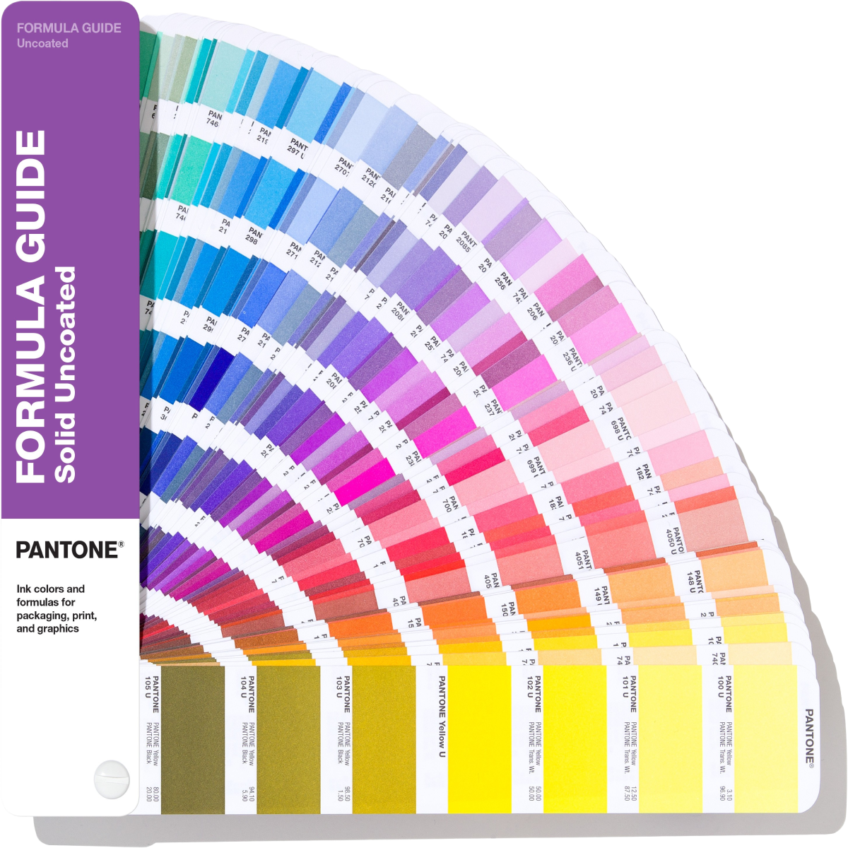


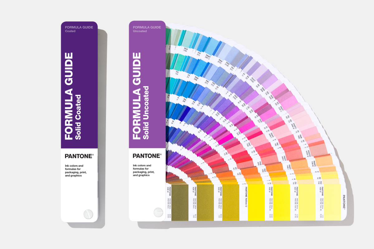


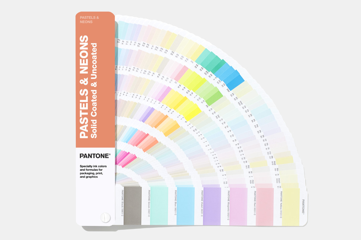


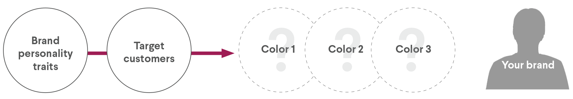


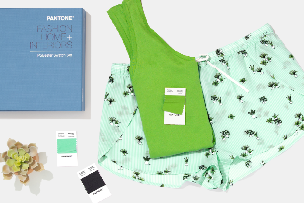


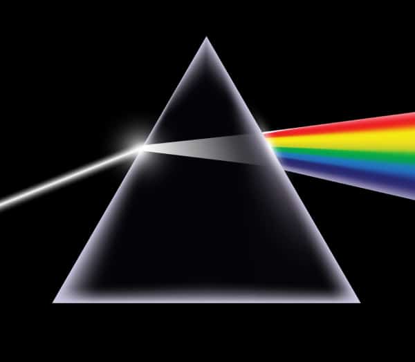


 Rod cells help us with low light night vision, while Cones help with bright light and color vision.